Adaptive vs responsive website design and development
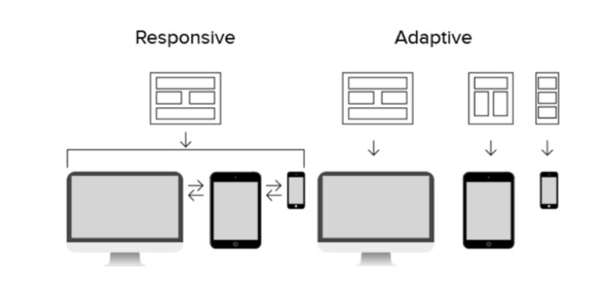
Adaptive design and development refers to the development of multiple fixed width web pages, optimized for different screen sizes. Generally an adaptive design has six different sizes developed; 320px, 480px, 760px, 960px, 1200px, and 1600px.
The advantages of an adaptive design is in the speed of the design, especially on mobile devices. The problem with adaptive design is that it’s more expensive to develop, edit and maintain. As well it’s much harder to keep the site consistent. Most sites have moved to a responsive design format which is less expensive to develop and maintain.
While adaptive design creates multiple versions for different screen sizes, responsive creates one version of a website and responds to the screen size it has been loaded into. This is managed by one set of CSS media queries that gives the browser instructions on how to show and organize the content based on the browser’s size. When done properly this can be just as fast-loading as an adaptive design.