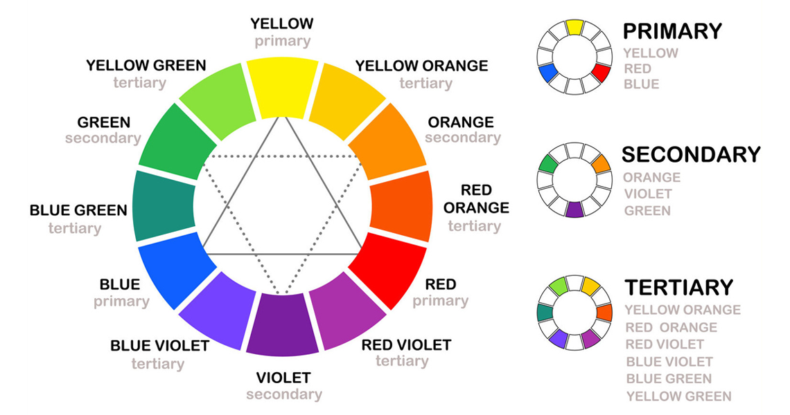
Color theory is a term that we use to describe the rules and guidelines around the use of color in design. These color principles are used for working with colors that involves mixing colors, considering the visual effects of color and creating pleasing color combinations. Modern color theory is heavily based on Isaac Newton’s color wheel, which displays three categories of colours: Primary colors, secondary colors and tertiary colours.

Color theory encompasses the effects that colours have on the viewer – or the psychology of color. Consumers can decide whether or not they like a product in 90 seconds or less and about 90% of that decision is based solely on color.
Warm colours like reds and yellows are generally associated with energy, brightness, and action while cool colours like greens and blues are often identified with calm, peace and serenity. There are more detailed explanations on how color can have a temperature and how it effects emotional response, but this gives you the general idea of how you need to think about colour before you start a design. More information can be found at Smashing Magazine – Colour Theory for Designers.