Responsive Design example from Interaction Design Foundation
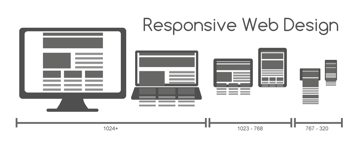
Responsive design and development refers to a way to design and code websites such that they can adapt to different-sized devices like phones, tablets, wearable devices, etc. These are flexible designs that re-size the content on the page, based on the size of the screen. This differs from adaptive website design which involves building multiple fixed width webpages for a specific screen sizes. In adaptive design it’s normal to develop for the six most common screen widths: 320, 480, 760, 960, 1200, and 1600 pixels. Responsive design is an efficient way to create one webpage or website that will adapt to any screen size, and is an example of user interface plasticity.
At the core of responsive webpages is CSS media queries that tell the browser how to display the page at different sizes. This is a powerful way to develop responsive sites. It makes development faster, more consistent and less expensive to edit and maintain. Because many of the html containers, images, fonts and other items need to be flexible, they’re sized using %, or rem, or another relative unit so that they don’t display outside their containing element.